 Heyas,
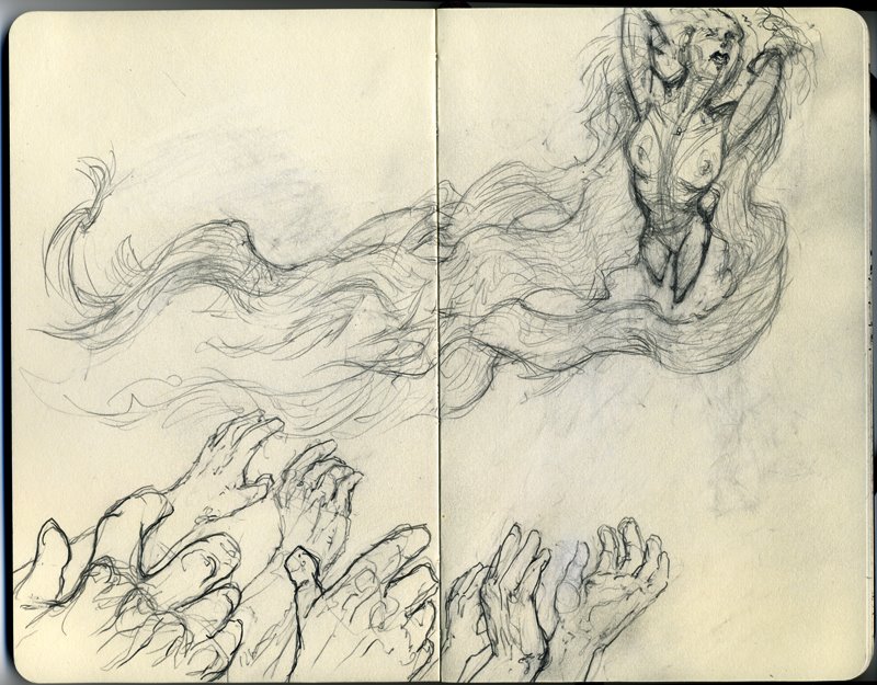
So here's a sketch in progress. I was thinking about Medusa, the Inhuman, and wondering about all that hair. In this image it could be hair, it could be fabric or some kind of magical warping thingee. That has to be decided soon.
The grasping hands at the bottom - I'm okay with for now.
But I was wondering about the woman's anatomy. Seems like I'm not really getting the foreshortening right. Maybe I should move the hips and legs up and behind the rib cage more? The arms and shoulders also look wrong. Comments?
9 comments:
Hey Dok, I'll take a pass at the female figure improvement. Where She's at now just trace up a sweet sillohuette. When you get that very pleasing shape that tells her story in a pose you like just make sure on things like arms you do the occasional draw through and around of the cylinder of those arms. It's weird, I turned 50, been an artist for years without being clear on what people meant when they said draftsmanship. I had to take a course with Marshall Vandruff to understand all it means is drawing through the form with proper little cylinders and volumes for placing any figure in space. I agree with your own reaction to her hip placement. More twist (contra pasto? that the word?) Maybe one leg more forward and her potbelly (technical term from PULP FiCTION) owning the picture plane in her crotchal area. And the hair on the right side, maybe straighten almost all that action on that side to a line of action that flows up out the direction of the hands. Make it calm on one side, crazy whirley on the other. That's about it. This is good exercise for me. i'm about to write ruminations on what I'm seeing when I look at a Hanna Barberra style cartoon. That's my whole emphasis right now that i'm taking this Stephen Silver Character Design class.
For instance, this is the sort of thing I got out of studying Mike Mignola and righting notes about what i was seeing...
Mignola Observations
1.50/50 black bleed to edge / always cleanly panel / nothing emerges from panels or breaks panel border
2. Alien Sanctuary averages 4 panels . Fafrd averages 5 panels a page
3. Minimal Hatching
4.Feathering on curves only- minimal Dashing
5.Posterization - Drop out all extraneous line
6. Curves are often done with averaging straight lines.
7.Black at least 50 % of page
8. Colors are flat
9. No more than 6 colors
10. Color is not brilliant, dulled , grey. Some Reds Yellows Whites
11. Thumbnail level of detail
12. Impulse to sillohutte is followed even when figure is on a black field
13. No motion lines. - Pose captures the action
14. Radiation of energy blocked - No Hatching (Too busy to do so)
15. Settings are framing devices or they are omitted
16. Faces are 50% Black at least / Usually sockets are black. No eyeball.
17. Faces - No feathering- Flicks indicate muscle striation
18. No continous line delineation of muscle
19. 99% of the lines are Freehand - Machinery occasional exception
20. Don't draw feet connected to the ground / Look for devices to obscure this
21. Ground contours are dissipated very painterly
22. Blacks are based on frazetta paintings _ Think Painterly
Dear Dok,
The idea is good, the hands are good. I agree the perspective on Medusa needs work. But more than just the perspective, it's the construction that looks a little off to me.
Ellis laid about two months worth of good advice out there for us all to digest, and I know I appreciate it (esp. the Mignola research), so I'll keep my comment brief.
From this view point, given the exaggerated perspective you're going for, we'd see a lot more of the TOP of the torso, that diamond shape that begins at the pit of the neck, travels out along clavicles to acromions, then back along spine of scapula and up to 7th cervical vert. This'll help plant that neck, too. The locat'n of the acromions and clav.'s is vague enough right now that we (the viewer) have a hard time picking up the upper outside borders of the ribcage, which gives us problems with the lower ribcage borders, which look OK by themselves, but they don't relate well to the upper part of the torso.
A lot of this may be due to the breasts--more emphasis on the pecs, and a more top-down perspective on the breasts (which should be extremely "stretched" in this pose, anyway) would help.
The arms don't seem to correspond to your foreshortening scheme. Too straight up-and-down; elbows should be closer.
I agree that stacking the hips behind torso in a more foreshortened manner would help--and what'll make this read is her "rear shelf" being visible, and overlapped by the ribs (think of a Sport Illustrated chick lying on the beach, butt in the air, facing us--you can really see her ass project).
It's foreshortening problems like this one that take all the fun out of drawing.
And, if I may quote:
"What we demand is not deference--what we demand is reciprocity!"
--Porthos
The Three Musketeers
I expect the same rough treatment.
I agree... I'd say hips larger and more behind the ribcage... and thighs staying in proportion to the hips. Breasts stretched is also a good comment.
I'd also add that the index finger on the largest hand seems a little awkward... either the other fingers should be bent a little bit in the same direction or the index finger should be less bent. I noticed this because I do it all the time!
Content-wise it might be nice to see a visual connection between the hands and the figure... a background/design element that unifies the two, or maybe the tendrils of hair gets interweaved with the fingers of one of the hands. That may not be the commentary you are shooting for with this drawing but I would I think it would make the overall image stronger.
I will also add that I could use some critique on my comic strip blog. It's very rough and sketchy, and it's not so much the drawing as it is the story telling... I want to make sure the story is clear, interesting and entertaining. http://rickart.blogspot.com/
You guys ARE THE BEST! Thanks SO much, this is just what I was hoping for - and it's not even Christmas.
I will use ALL of that, and I think that I'll also flip the figure horizontally, to get a better flow through the composition.
Hey Mr G, by coincidence I'm taking 4 animal anatomy classes from Marshall Vandruff later this month! Now I'm REALLY looking forward to them.
More thank you's to follow - Ann's calling us for dinnner.
Animal anatomy! Cool! Be sure to share some of those drawings with us! I'm sure we can all learn something from that... well, except for Eurochino perhaps... ;)
I can't add anything to the great drawing and anatomical advice already given. But my gut reaction to the sketch is this: The extreme perspective on the figure implies that she's flying towards us, but the hair flow implies that she's moving sideways. So the final visual effect is somewhat ambiguous. I know you said you were going to "turn her sideways" but if you keep the same extreme perspective I think it will still feel funny to me. The foreshortening is such a powerfull eye-puller, I would feel more comfortable with the hair swirling around her in a kind of vortex or halo so that it complements this pull rather than contradicting it. But then of course, the relationship between the figure and the hands will have to be adjusted.
I've taken Vandruffs anatomy class and that was great. He's a very talented lecturer. I also took a storytelling seminar and the Draftsmanship seminar ( could have been subtitled Perspective) both great info. And I have his awesome lectures on perspective on DVD. Filming done during the courses. About 6 hours of lecture on perspective. Vandruff's God is Windsor McKay and a lot of his personal learning has been a chase to get as good at perspective and draftsmanship as McKay. And his other passion is teaching anatomy. I also have the Animal anatomy DVD which I recommend.
Good point there Tom, I was thinking the same thing this weekend about the hair and the basic rhythm line for the figure not being in sync.
Hmm. I want the general compositon to stay basically the same - hands in lower left to lower middle, figure in upper right to upper right middle.
So... maybe I'd be better off if she was horizontal or nearly horizontal, like the direction of her hair. She'd still have her back to the background but curving towards the camera on the right side instead of away towards top right.
I'll play with that.
Thank Mr G for the info on Marshall, a guy who admires Winsor McKay is McOkay in my book.
REALLY GREAT Mignola notes by the way. No's 15 and 20-22 really got me to thinking. By "setting" you mean estab shots and interior environments, etc?
My tuesday sketch will be the Hanna Barberra thinking I've been doing. On Note 15, yes,Mignola typically just draws a figure with no background. And if there is a background it frames the figure, deletions of parts of the background based on the remnant being a frame for the figure. And just the opposite where a setting detail, a still life pretty much, has no figure in it. Number 22, I got that from Mignola himself when I asked him where he got his black spotting ability. I expected him to say something like Alex Toth. Instead it was Frazetta. And last Wednesday, Stephen Silver was asked by someone about what he valued and got out of the Frazetta posters he had in his studio. He said he really liked the shadow shapes. That's one thing the Master did better than anyone, working as all painters do from the General to the specific, Frazetta's general was so good he didn't really have to finish paintings. Of course for some cursed reason he is now finishing them with his un stroke afflicted left hand.
Post a Comment