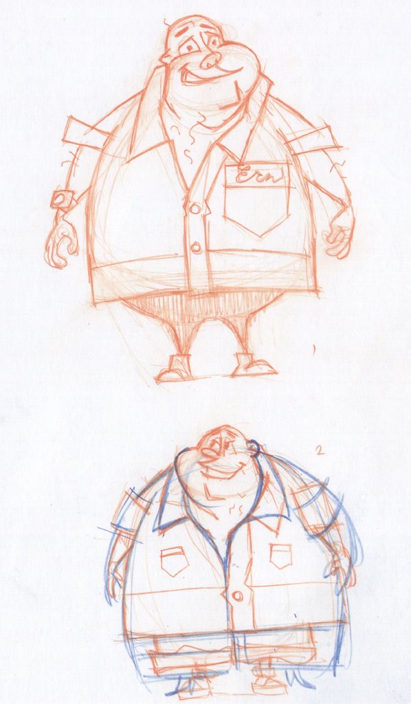

Examples of my attempt to get the swing of cartooney character design. The Blue pencil is Silver refining the designs I brought in. I went with the guy having a bowling shirt and kind of a childish demeanor. Thanks for the guidance on "cartooney" Jeff.
5 comments:
Marty,
Great notes and I agree. I know I can do better and it's frustrating right now because I am thinking of rules etc and not interacting with drawing creation. I'm all over the Kricfalusi stuff. Thanks. I would love to be the next Ed Benedict. It makes the perfect out-of-ones-reach goal to make a better artist.
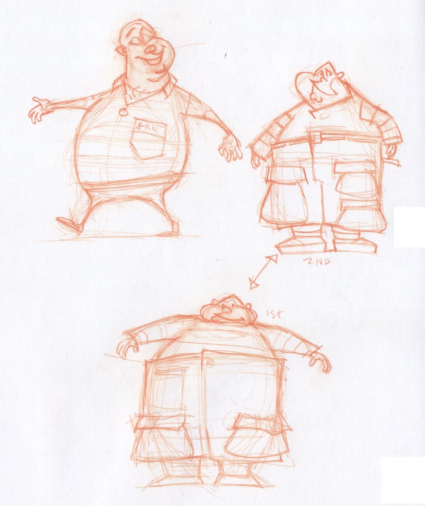
The face and the body on the big guy are moving in the right direction. The little forehead and big mouth/jaw area is fun, and the little hands and feet make his girth more comical. I think the arms on the guy on the right are more successful because the upper and lower arms are of different lengths. I like the pose on the guy on the left, and I like the wide set legs on him. Either bringing the legs together or spreading them wide will work better than somewhere in-between.
I think your impressive instincts as a draftsman (there's that word again) are sort of working against you in this situation. I think you need to go even flatter and more graphic with your designs. Instead of using texture to describe the volume of his gut, use a regular pattern across his whole body to flatten him out.
Love the 5 o'clock shadow! That's a element that I love but never use myself.
What erudite comments!
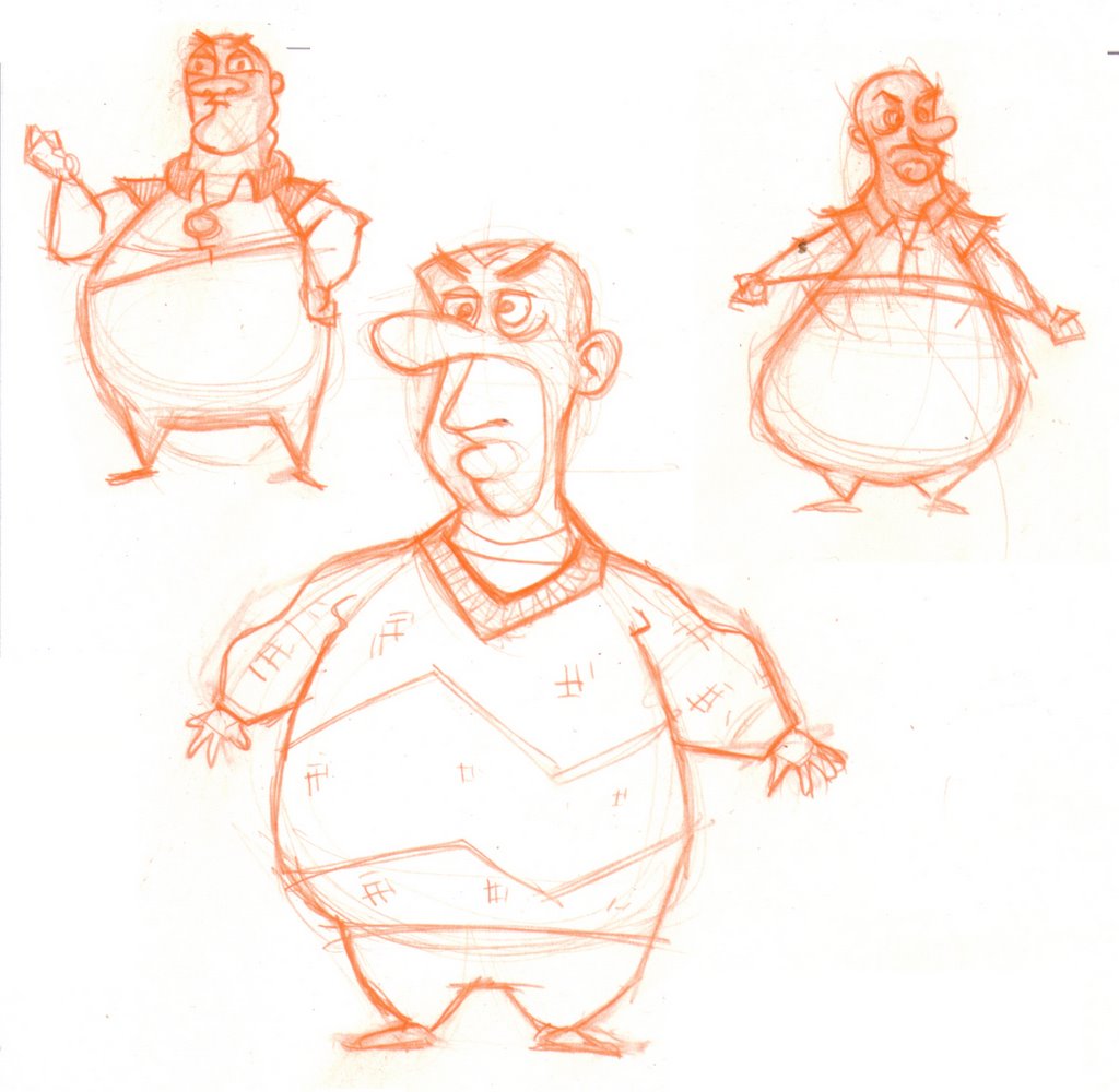
It's inspired me to add the following:
Ahhhh LAAAAAAAAK 'm
So amazed at your cartoon skills Skribbl, having not one iota of those myself. It's always seemed so dificult to find JUST a few _perfect_ lines.
Instead I toss in a ton of 'em and hope that one hits the mark they all should have!
The weight of the belly seemingly reacting to the direction of the gaze is delightful.
As far as more helpful critiques, ya best ask them others wot say them smart words.
It all boils down to simple shapes when going cartoony. Circles, squares and triangles. Try to reduce your lines and shapes into pleasing arrangements. Throw anatomy out the window! (sorry Marty) Uh....the two cent comment.
The new ones are great! The bottom drawing on the top page looks to me like the most winning... loads of personality and the right amount of detail... and great shapes. I suspect that his feet are still a little "perspectivy", but otherwise a real winner!
Post a Comment