

That guy I linked to below, DataJunkie, has all those great Pulp covers. I'm going to paint this thing but I'll use one of those pulp covers as a layer and straight up use it's lurid (but pleasingly complementary) color scheme. Then take it into the ART RAGE program and give it an oil look. Wish me luck.
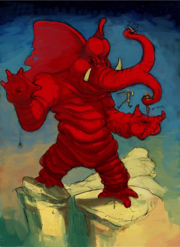
I started on the color last night. I brought in the color scheme of a pulp magazine and it was cool because it made me think about the color another artist had chosen. For instance I realized I can only go darker with that red on the elephant. The bright red is the lightest red. If it was me usingred, I'd mess it up by making a selection in photoshop and lightening. But studying the other artist, I realize that red should be the lighest the red gets.
I've Included the cover I got the color scheme from
3 comments:
That's fantastic Ellis. I especially like the little "guts" indicator sign. You've gotta keep that in the finished piece.
Yes. I agree with Tom. Keep it in and maybe enhance it with other humorous labels (various names for the other captured and/or dead crewmen, as though it's a Star Fleet schematic or something). Heh heh ... I like all the rolls of flab on the Monstrophant's body and the way the humorous elements are at odds with the horrific things it is doing! Nice work!! Oh, last thing ... I love (and must appropriate for my own work) the little guy caught mid jump/hop/skip ... A great gestural element that adds action to the drawing.
It's like Ganesh from Mars. An appropriate enemy forr an Indian Giant Robot.
You are a dangerous man, Mr Goodson.
But you were a very cute kid!
Post a Comment