
Howdy,
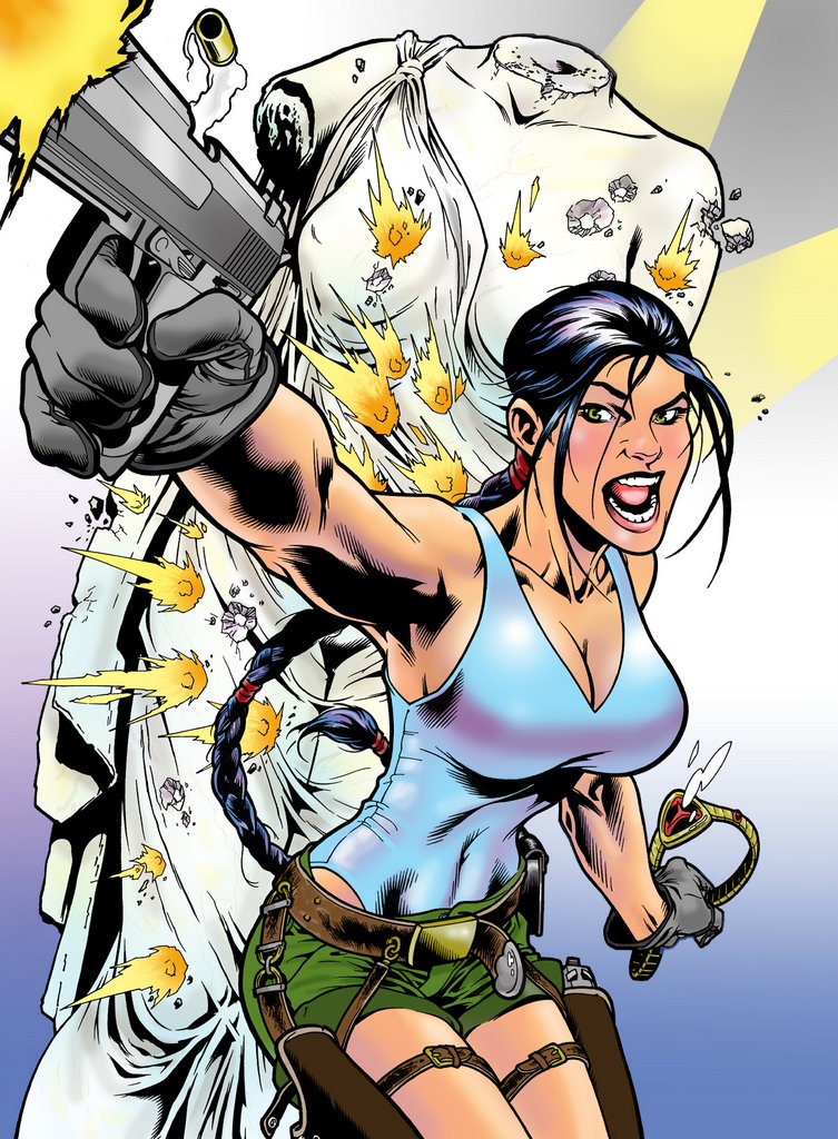
In my attempt to find a full time art position I had realized that due to my extended stay in the comic book field I didn't have much color work in my portfolio. So I got on Photoshop and started to fill that gap with a few drawings I had previously done. Here are a couple, let me know what you think. I haven't done much of this so any suggestions would be appreciated. Advice from Jeff will be taken with a grain of salt and any from Ellis, of course, will be outright shunned.
Also, I've posted samples of my portfolio at a website if you ever want to check it out:
http://www.maj.com/cgi-bin/gallery.cgi?f=123778
(Jeff, sorry I haven't called you back. My Dad's in town and he's about 7% more important to me than you are. I'll call you soon.)
(Ellis, you are king, you know that... well queen at the very least.)
5 comments:
I was wondering why you didn't call me back. I can live with the 7%. 8% would have sent me for the nearest bridge.
I'm no expert on color so you will definitely have to take this with a grain of salt. They look a little light on the coloring. Maybe it's because you haven't filled in all the white space. Just an observation. Also, you might want to go heavier on the color of Laura's gun to make it pop more in the foreground. Funny you mention color because a friend of mine has a blog that deals with quick coloring tips:
http://photos1.blogger.com/blogger/1250/2135/1600/wilsonpainting01.4.jpg
http://photos1.blogger.com/blogger/1250/2135/1600/wilsonpainting02.4.jpg
http://photos1.blogger.com/blogger/1250/2135/1600/wilsonpainting03.3.jpg
http://photos1.blogger.com/blogger/1250/2135/1600/wilsonpainting04.3.jpg
I found this to be very helpful because I'm scared of color.
Color should frighten us all. Hey, why weren't these great expositions on color IN color?
Scott, I think the color is about on par with the average comic colorist. You might try the idea of desaturating that color layer, turning it into grays. Duplicate your color layer first so that's still around. Then look at gthe gray layer, all by itself and just make that grey intersting to you as a value study. Pump up dark and light etc. Then turn on the color layer on top and set it to color. see what that does for you. Cheap trick but in can give some good results. Did you get my email about how to submit stuff to my company? By the way, I knight thee, Sir Putz
Wow! Checked out the other samples, very nice!
Yes I agree with Ellis on the value study! That will breath life into your coloring. (writing that down in my own notebook)
Do not fear color... color is your friend!
I'm with Ellis... I'd throw in a background color to eliminate the white.
Secondly, embrace the layers of Photoshop. What I do is lay the Background in one layer, then the subject color, just the flat colors that you want things to be in another layer and then I have a lighting layer and a shadow layer on top of that.
I paint frequently paint the lighting layer with a very light, very pale yellow at 50% brush opacity... this gives me some room to make the highlights very hot and some areas not so hot. Then I tinker with the opacity of that layer until it mixes well with the subject layer.
My shadow layer is set to "multiply" and I usually pick a middle to darkish blue/cyan for it. Again, I paint it at 50% opacity so I can have a range of darkness to play with. Also again, once I'm done with the painting I mess with the opacity of the layer till I get a nice mixing of the shadow color with the subject layer.
Sometimes I have a secondary light layer that I will paint in the shadow areas.... this will often add volume to the subject of the drawing.
Also, sometimes I will have a solid bright color layer on top of everything else that I set to multiply... and then crank the opacity of the layer into the teens... this will unify the colors and make them of a similar "family".
I think you may be a bit timid with your value range because you want the drawing to still read under the color. You are thinking too much like a penciler and not enough like a colorist.
BTW, everything I know about color I learned from Joe Chiodo. If you want a cool place to rip off some palettes and color ideas from, buy one of his books.... or just look over some of his comic coloring. He saved a lot of those early Image books with his fantastic colors on top of those over-detailed drawings.
Also BTW, Cryptic Studios just announced that they are doing a Marvel Universe Online game... they might be looking for comic artists with game dev experience!
Post a Comment