Selling it on Ebay of course.
 Color version is ripping the colors from a sunset beach photo
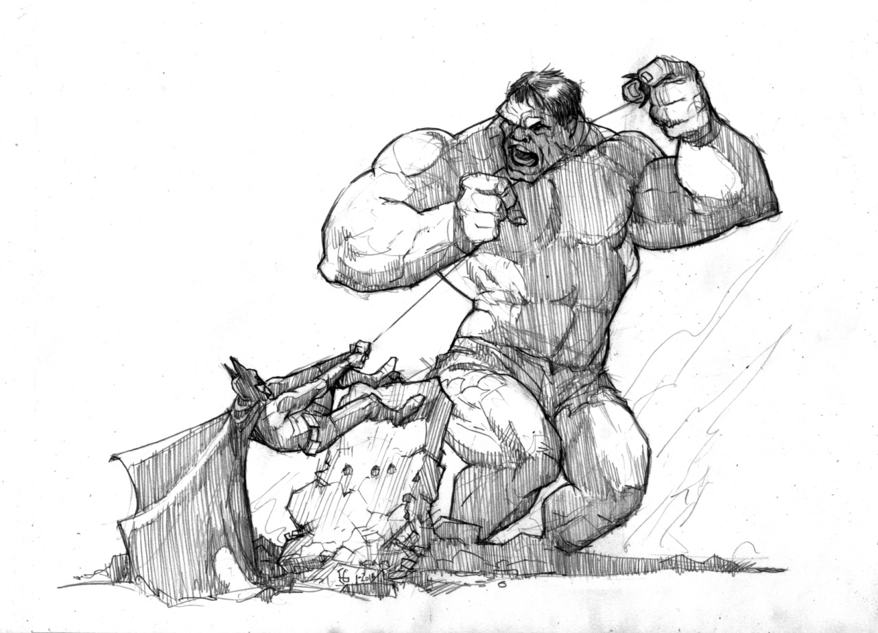
( Hulk obviously not green- to color seers anyway)
Filtered with brush stroke filters, smeared, to bring down the line.
Idea was to have something to paint into on the cintiq.
(this is all mouse)
I want to paint with a brush that rotates a squarish tile as I paint.
Make it "thick" paint looking.
( Hulk obviously not green- to color seers anyway)
Filtered with brush stroke filters, smeared, to bring down the line.
Idea was to have something to paint into on the cintiq.
(this is all mouse)
I want to paint with a brush that rotates a squarish tile as I paint.
Make it "thick" paint looking.
8 comments:
Love how SOLID everyone looks--esp'ly HULK. Great stuff. I don't know where you are with wanting to add color to this sort of thing, but when you draw a scene like this, I can easily see some watercolor being added--in that pale Mignola style that is more like a "tinted" drawing than a real painting.
Like: http://cdn.halcyonrealms.com/blogpics/hellboylibed01.jpg
Or that cover painting for the hardbound "Art of Hellboy":http://www.darkhorse.com/Books/Previews/12-283
p.s. This HULK is great (I think all-caps is appropriate for him, don't you?), but I have to say whenever I imagine you tasked with drawing HULK, I picture you going to the earliest Kirby model with the uber-Frankenstein brow!! Just seems very Ellis--and it's my favorite!
p.p.s. I am weak on the hot links.
Oh yeah Marty. I like that. Good idea. I did about 50 backward dance jigs to try to put some color in it last night. I'll post that just to show it. Could still dig into that result and a painting would come out.
My and my embed code. Doesn't really add that much convenience. Grabbing the url and pasting it into a new tab takes no effort.
This is interesting. The wonderful old tradition of combat aviation art- diluted with 3d and digital paints. Skybox- alpha edge showing on trees. Probably bout the main models from 3d stores.
I was going into an Adam West type Batman. There's been some recent work using that version in comics that I like.
Love the Adam West Batman stuff ("Batman '66" is what they're calling the print revival of this incarnation, I think). And the color is cool! The blurry bkg adds a neat depth.
I'd still like to see you do a version where you hit the original with a real simple watercolor wash. One color for each character, just thinned to represent light to dark. Black for the shadows. Like that Mignola cover. I've got this sneaking suspicion that that style would underline your natural tendency toward epic scale....
Very solid piece... solid looking and solid execution.
Love this sketch Ellis!
Thanks Tom. Got to average something like this weekly. My get some freelance from a company doing a superhero rpg. Have to hone my heroes.
Post a Comment