Tuesday, October 16, 2012
Aimed At Future Sketchbook Publishing vs Blogging
The note I gave to Marty on his Blog relates to post edits for book publishing. I think Stephen Silver does a lot of character cramming compositions for his books that cause a diminished impact for some really good character designs. It would improve Silver to have 1 or 2 on a page instead of 20 with yellow highlighter filling the negative spaces. Definitely don't copy Silver when it comes to page design on sketchbooks. What do you think? Drawings that you page through with lightbox. I want Marty to blog what he spontaneously produces. But even there I'm assuming he's scanning then arranging in photoshop. Composition is taking place right there. Not completely on the fly.
Marty vs. Ron vs. Stumptown
This was my drawing at the Stumptown Coffee shop when Ron and I went trawling for subjects....
p.s. Ellis, I agree with you that these drawings are better digested in bite-sized bits, but I like the smorgasbord approach for this post (gives a better overall impression of our outing).
Monday, October 15, 2012
Virgil Milliron or Lynard Skinner
Which is the better iconic name for a Gym Teacher / Wrestling Coach. I vote Virgil Milliron.
ADDED BY MARTY: I wasn't too far off!
Very Weird
I was talking on the phone to Marty. Last night. Today I was going through a bin of old art. Getting ready for another go-round with ebay. And found something directly related to the last thing Marty asked me about during our talk. The name of my High School Art Teacher. Morine Long. He hated it. He's going with his own idea of what my art teachers name should be. Also discovered . Some article I cut out of a magazine 33? years ago. All about talents being found. Me being one of them. The back of the clipping is the only clue I have as to what magazine it might have been.
Sunday, October 14, 2012
Ron vs. Stumptown
T.A.G. brethren (and sistren), I had the pleasure of hosting our esteemed colleague Ronald Thompson yesterday. I say hosted, but it's Ron who drove down and treated me to lunch. I reciprocated with an invitation to sip some coffee and do some sketching.
We hit the Stumptown Coffee on 3rd, just down from Voodoo Donuts (not bad when they're fresh, but a kinda skeevy crew that, the Voodoo folk). Ron started with this one....
He recorded my reaction on the page. But it worked. Looked at this gem he scratched in response to my provocation....
(Note coffee stains for added texture...hey, they're authentic!)
Ron did these in run-o-the-mill lead pencil, but when I scanned them I used Beata's (or Candice Colbert's?) line-art Pho-Sho trick to recolor the lines (I chose espresso bean brown--good choice, huh?), and dropped it on a background of a creamy milk-foam tint. What do you think?
We hit the Stumptown Coffee on 3rd, just down from Voodoo Donuts (not bad when they're fresh, but a kinda skeevy crew that, the Voodoo folk). Ron started with this one....
He recorded my reaction on the page. But it worked. Looked at this gem he scratched in response to my provocation....
(Note coffee stains for added texture...hey, they're authentic!)
Ron did these in run-o-the-mill lead pencil, but when I scanned them I used Beata's (or Candice Colbert's?) line-art Pho-Sho trick to recolor the lines (I chose espresso bean brown--good choice, huh?), and dropped it on a background of a creamy milk-foam tint. What do you think?
Some one may have posted this before. Color App Page
Color Scheme Designer Love ALL the buttons on this app. Try everything. Led to it by this super aggregator of a Tumblr. Tutorials for Artists.On the tutorials page, I recommend the Christopher Hart- Drawing Cutting Edge Anatomy. Goofball title but great presentation of material. I undeservedly absolve myself of the pirating stain by noting I've bought a couple of his books before. This is his best I've seen. If I ever switch gears where I'm buying instead of selling, I might get this one. I like the Colorblind button as well. I'm probably the every common 5 percent (dueteranaomaly). That seems to subjectively jump and shift the least when it is pushed.
Saturday, October 13, 2012
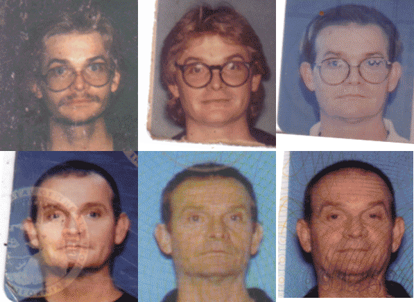
The DMV is wearing me down
Time span is Sept 1981 to Sept 2012. The first mustache is off an Oklahoma license. The rest are So Cal licenses.
Friday, October 12, 2012
Tuesday, October 09, 2012
Just Did This
Doing about three environment notions that are somewhat like a screen test for some freelance. Felt good to draw a little bit this morning. Quick nap, have some coffee and do the next two. Coffee and this type of sketching don't mix. Better than Diet Coke though. Really glad I gave up that witches brew.
Daniel Clowes Panel (Oakland Museum of Art)
In July I drove down to Oakland to see a museum retrospective of Daniel Clowes work. Such an impressive show--he's my favorite comic artist, so I was bound to enjoy it. But beyond the great art (and there was plenty), the museum really out-did themself (themselves? theirselves?) with the exhibition space.
Lots of fancy touches like enlarging exemplary panels and pasting them around the upper border of the walls. Two monumental structures anchored the floor space--they were painted dark gray and decorated with street scenes from Clowes' comic world. These background drawings weren't ainted on--they were carved into the surface. One even had a quilted crash pad kind of seating for folks to stretch out and relax.
As I wandered the exhibition, who should show up but the artist hisself. He was walking Chris Ware (his pal) through the show. Tho' a dozen or so folk filled the gallery, no one recognized them as they made their way along the walls.
I was desperate to listen in, but didn't want to harass them. So I held station at the front of the room where I was sketching, and watched them orbit back my way. Seeing these two icons of contemporary art comics confabbing, I knew I had to attempt a sketch. What glory for my Brushpen Breakfast site! What a scoop! I started to scribble...
...but the pressure got to me. The drawing below is a post-facto reconstruction.
Later the two sat down in the museum auditorium and talked about their work. The line to get in was almost Comic-Con long--too many people for us all to get in. Fortunately, I was the LAST PERSON ADMITTED. Phew. Would have been a bummer to drive down from Portland and not see the talk.
But the talk was hampered by a discussion leader (the head curator) who knew little about Clowes work..and of course the ubiquitous audience questions that were all pretty lame (not that I had better!). Mainly Clowes tried to set the curator right on his lack of knowledge, and Ware kept telling the audience how incredible Clowes is (an endearing thing). During the whole event, Clowes came across like some kind of grizzled diplomat, or even a retired CIA agent: someone who'd seen it all, and lived to tell about it.
Great show, (and sorry to say it's over).
Lots of fancy touches like enlarging exemplary panels and pasting them around the upper border of the walls. Two monumental structures anchored the floor space--they were painted dark gray and decorated with street scenes from Clowes' comic world. These background drawings weren't ainted on--they were carved into the surface. One even had a quilted crash pad kind of seating for folks to stretch out and relax.
As I wandered the exhibition, who should show up but the artist hisself. He was walking Chris Ware (his pal) through the show. Tho' a dozen or so folk filled the gallery, no one recognized them as they made their way along the walls.
I was desperate to listen in, but didn't want to harass them. So I held station at the front of the room where I was sketching, and watched them orbit back my way. Seeing these two icons of contemporary art comics confabbing, I knew I had to attempt a sketch. What glory for my Brushpen Breakfast site! What a scoop! I started to scribble...
...but the pressure got to me. The drawing below is a post-facto reconstruction.
Later the two sat down in the museum auditorium and talked about their work. The line to get in was almost Comic-Con long--too many people for us all to get in. Fortunately, I was the LAST PERSON ADMITTED. Phew. Would have been a bummer to drive down from Portland and not see the talk.
But the talk was hampered by a discussion leader (the head curator) who knew little about Clowes work..and of course the ubiquitous audience questions that were all pretty lame (not that I had better!). Mainly Clowes tried to set the curator right on his lack of knowledge, and Ware kept telling the audience how incredible Clowes is (an endearing thing). During the whole event, Clowes came across like some kind of grizzled diplomat, or even a retired CIA agent: someone who'd seen it all, and lived to tell about it.
Great show, (and sorry to say it's over).
Monday, October 08, 2012
Sunday, October 07, 2012
Pre Code Kubert
Got this from Tumblr. Fantagraphics offering a PDF preview of a book of pre comics code Joe Kubert. I enjoy the Kubert looseness, getting almost into a Ditko kind of posing.
Saturday, October 06, 2012
Friday Film Frame- You Oughta
Henry The Worst Does these animated gifs on his Tumblr. He's been doing directors and the FuckYeahDirectors picked up on it and distributed it that much wider. I think Friday Film frame could really get going on Tumblr.
Friday, October 05, 2012
Negative Halftone - Scanned to Reveal Inverse
I found an old negative, dating to 1975-76. I know this time because the inspiration for the painting was my visit to Kansas City. Where I met Richard Corben at his house. And he had the painted comic DEN pinned up on his studio walls. The art was painted in Gray. He then did overlays and made his own halftones for the color. I did a little color mess around with it. May dig into it as a before after type of thing. 37 years apart.
Wednesday, October 03, 2012
Kirby How-To
Good stuff. I found it while I was looking into Kirby Crackle Links to Monster Dwell Stuff-Via Sherm Cohen on Twitter And Hulk when he wasn't splash page size
Labels:
Jack Kirby,
Kirby Crackle,
Where Monsters Dwell
Monday, October 01, 2012
Interesting-I'll be curious what he gets for it
I sold it to him for 250 bucks, buy it now, on Ebay. What will he manage to get for it? I thought he just loved my work. AUCTION Different guy. This guy gave me 920 bucks for 5 or 6 sketchbooks. If he sells two pages, he'll make a profit for what he paid for individual books. I'm still enjoying it even if it means I could be savvier about the worth of things. I like that the art will take off and find new homes all over the place. I feel like I'm Van Gogh with the art migrating around. With top dollar being paid for it. Gives me a much needed confidence boost. EBAY SATURN VECTORMAN
Friday, September 28, 2012
Followers?
I've just noticed, (after how many years?) that we have ten followers that follow the TAG website. Rolling over their icons I don't recognize any of them. Who are they? Friends of some of you guys? Random people who found us by accident and like to listen to us talk? WHO ARE DESE GUYS?
Thursday, September 27, 2012
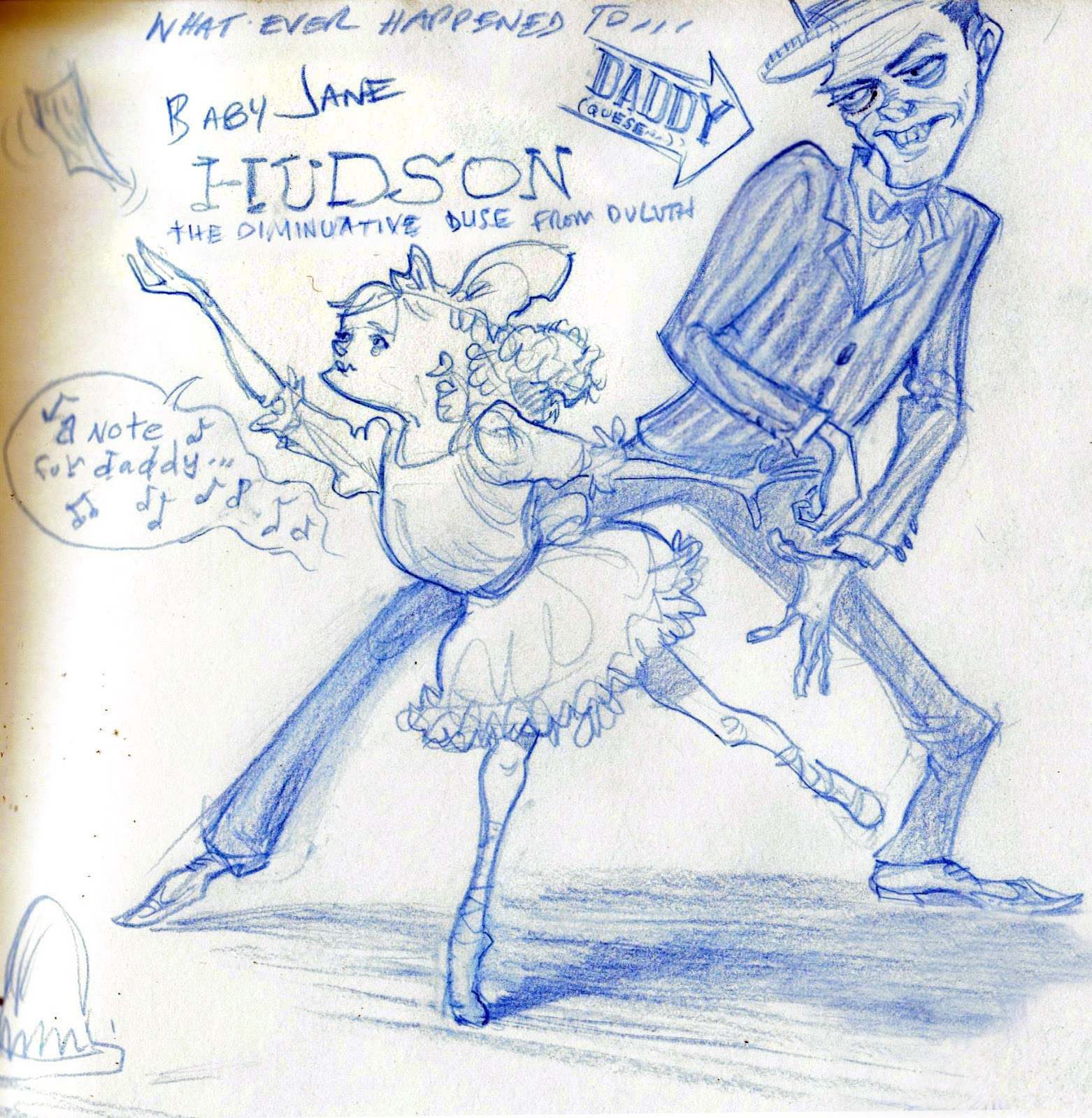
I'll Explain
left- I think old "Jungle King" has been picking his fights a wee bit cautiously.
right - With one uncharacteristic misstep Molecule Boy entered the Sidekick Hall Of Shame.
left- "Collins! I've rethought some of my assumptions about dynamic data retrieval!"
right- After years of never hoisting his fair share of the load. justice comes Randall's way.
Some of my ebay sales, people wanted extra bit of random stuff like game promo paper etc. That got me into the dust bunny area of the shelf for archived-in-sleeve ring binders. This is just a bit of some of what I came across.
One of Jeff Watts first flyers. Me as a gag cartoonist on a strip I called The Underlings.
And a Computer Edge cover.
All this stuff is about mid late 90s.
Subscribe to:
Posts (Atom)