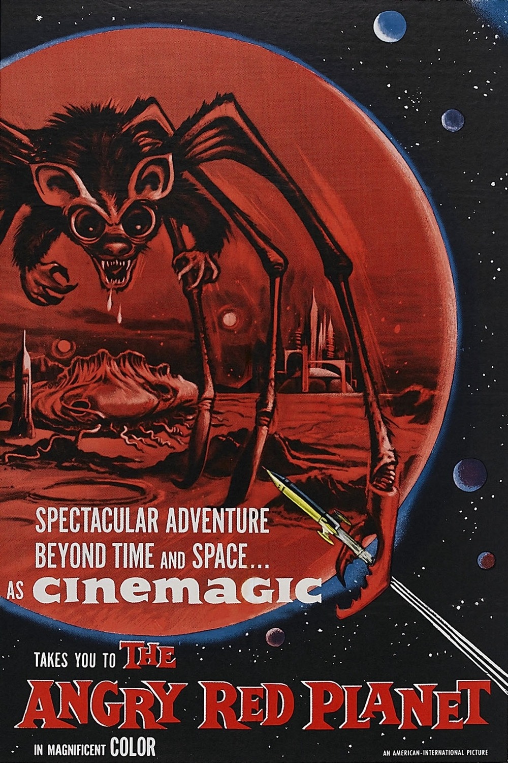
The Angry Red Planet
Some great movie making. Cheezy but the best kind.
 Commission's 'final' color.
I'd change it if someone convinces me it's got something too weird going on as a color choice.
The badly calibrated cintiq screws things up as well.
 The commissioner reacted and likes it. But would like some of my overlay on colorizing sloppiness cleaned iup. Here's the grayscale I colorized. That could stand some value changes and clean up as well.
MARTY UPDATE: possible desaturated alternative approach: do a super simple multiply layer of desaturated color blocks. I brushed in a little ultramarine blue/purple over the sky on opposite corners...You've already got all the important stuff. You can see my mouth mod, and I shrunk her jaw and smushed her nose in just a wee bit...

I'd change it if someone convinces me it's got something too weird going on as a color choice.
The badly calibrated cintiq screws things up as well.
MARTY UPDATE: possible desaturated alternative approach: do a super simple multiply layer of desaturated color blocks. I brushed in a little ultramarine blue/purple over the sky on opposite corners...You've already got all the important stuff. You can see my mouth mod, and I shrunk her jaw and smushed her nose in just a wee bit...
12 comments:
Oh Damn!
Just watched The Time Travelers a few weeks ago
I was just watching Time Travelers on youtube. Really compelling storytelling. He knew how to draw you in.
watching The Angry Red Planet now
Terrifying set pieces in the expedition scenes. The plant scene completely iconic. The skyscraper Bat Rat was the most fun. But the giant Blob in the lake. That terrified me. From that point on, Blobs became my number one horrifying monster.
Time Travelers had a scene that just transcended the movie itself. The future girl that is hot for the handy man Danny. Serenades him with her light display theremmin-like instrument. That was so cool and alien feeling. And I absolutely hated it when I was a kid. I thought- "dang weird ass euro movies." I wanted something up my alley from Universal monsters.
Alex Toth designed the Spider Bat/Rat
Loved the whole look of Angry Red Planet. You couldn't get more SCI-Fi pulp cover like than that movie
I've always wanted to get the Angry Red Planet into a digital format where you could edit out thered filter effect. In fact, turn it into something as close to a Mario Bava black and white movie as you could. Not to replace in anyway. Just to see the ffect. I have the special extra disc of THE MIST where they make that color film BW. It's better that way.
Why is Superman's "S" yellow instead of red on a yellow background? And why the yellow stripe on the top of his boot?
The girl's costume is made up so I guess the yellow "S" doesn't matter on her.
Ellz, the drawing is great. I like the tonal version best--can you just do a few color-block tints over that? Make it look like the recent Superman (dark) movies? I like the black space, too--very cosmic.
Have you done anything more with that color-correction technology?
THe two movies you cite sound cool. Never saw many of those 60's sci-fi flix...grew up a Star Wars/2001 snob, but now they look quite intriguing! Love yr idea for a b&w conversion....
...and don't forget--nobody asks Mike Mignola to do a commission 'cuz they want to see his color work. If they NEED color, he calls Dave Stewart. Which is to say, don't worry so much about color!!
...one last thought: the drawing is great, but did you play around with just blowing away the lip line between their mouths? I did a dbl take and thought the round of his lip interlocking was in fact a tongue bulge...
...which was just a little "ick"...?
I really like your edit Marty. I'll use that as my new vision. Low saturation. And the lip lock is best when it disappears. Thanks.
Time Travelers musical number
Post a Comment