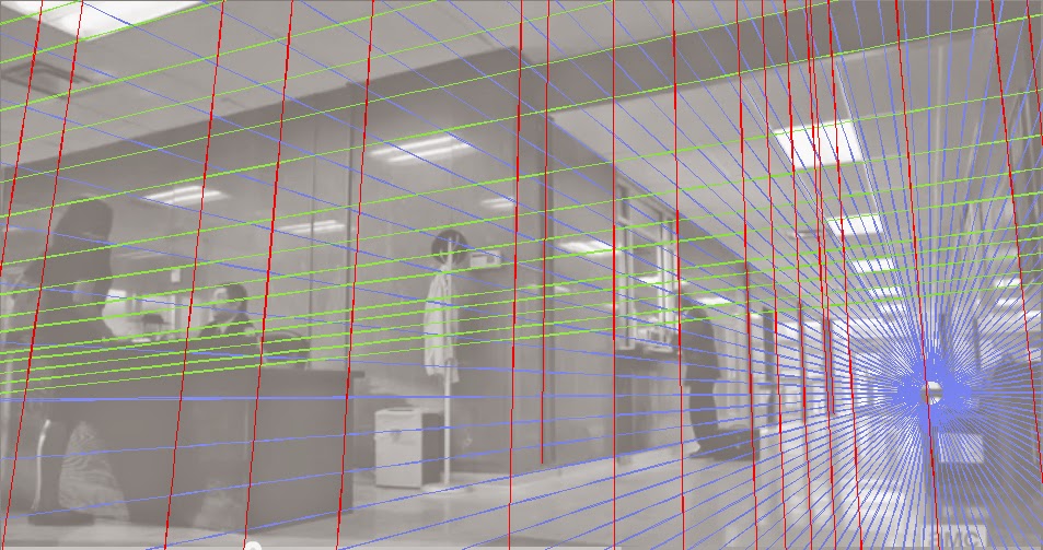
The image is a desaturated frame from
BETTER CALL SAUL.
Which has that same creative team as Breaking Bad. Using very nice lens keeping distortion to a minimum while giving very wide angle amounts of information.
There's a term for the lens that i can't come up with. Anthromorphic maybe. How the eye sees, close to it.
So I used that flooby nooby website's perspective star-vector object to make a grid.
The center of the grid going out the top is already ten times the height of the frame away. I quit when I got close. But you can see the difficulty of being a layout artist for films . Trying to get imagery really close to what the lens will see.
My only attempt at this on the animated Curious George movie was maddening. I had to do it on paper and couldn't get vanishing points far enough apart.

3 comments:
I didn't realize that the perspective had to be that accurate. If you had used the grid in its present form to draw the Saul frame with its slight inaccuracies, would the customer really care? Aren't the just trying to get a general rough feel for what the shot would look like?
The guy that was the lead on Curious George wanted his perspective a dead on match. Unless I was getting a signal wrong. I'd have to know more about other people's experiences as animation lay out artists to honestly answer if there isn't more leeway.
I really dig this new found power for making grids in photoshop. I never want to over complicate visuals but i want them to look right.
If I had this talent when I was whipping up my Deadpool sample over a year ago, that might have gone a lot better. I wouldn't have sputtered, stopped and killed my chances.
One solution on that sort of lay out could be to do it small, scan it , blow it up, light table that grid. That should be close enough for anyone.
Post a Comment