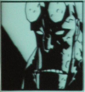
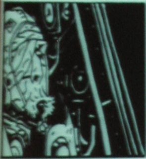
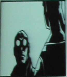
1. Close ups in Mignola Comics often crop off part of the head. This increases tension and almost makes the audience a coconspirator as if they are leaning in close to hear what the characters have to say.

2. Refer to the comics and observe how sometimes the top of the head is gone and other times the chin. It's not just a matter of cutting close. What is left in and what is left out causes a different effect.

3. Cutting off the back of the old astronauts head while including the instruments that crowd in on him gives a greater feeling of discomfort. Putting him to the side also weights the left side of the frame, creating interest.

4. Even if the character on the right is talking, cropping his head turns him into a framing element . Focusing our attention on the other guy in an interesting way.
5. Comic staging usually has to leave room for word balloons. We want to use some of that staging even without the dialogue blimps.
No comments:
Post a Comment