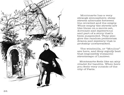
What do you guys think of this sort of thing? It's my current project, and it's just what the title says. The "copy" on this page is horrible--it's just filler to get a sense of composition, layout, format, marketability, what-have-you. Putting my inks to use.
I am soliciting opinions and suggestions--please help
Rick Says:
Well, I'm a complete sucker for this sort of presentation... this drips of the sort of classic illustration that I just adore. So, my first impression is that I think this is extremely cool.
As far as feedback is concerned, I think what you need to do is take your artist hat off and put your designer hat on. When text enters into the equation you are creating something that is a new piece of art rather just framing an existing piece of art, if that makes any sense.
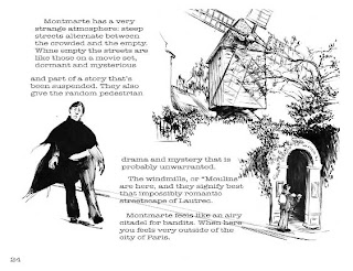
I would encourage you to integrate the drawings and the text more fully. I’ve posted one idea… I’ve broken up the drawing so that there is space for the text within the image so that the whole package is more unified. I was forced to flip the drawing so that the text would flow in the proper left-to-right, top-to-bottom fashion. As the artist and the designer, you are in a unique position to be able to manipulate your images as much as you like (or are willing) to create a pleasing reading/aesthetic experience for your reader.
I probably don’t need to say this, but I would also encourage you to make a dummy of the book… which is to say, print it out and staple it together. Seeing the pages side by side as they will be viewed by the reader with create new compositional ideas in your head that seeing the pages on their own would not present to you.
I expect that Maurie would know a lot more about this sort of thing than anyone else who posts on here. In fact, children’s books in general can inform you as to the compositional avenues that are open to you. Also, if you look as some Flash Gordon strips (the later ones where Raymond abandoned word balloons) you will also find some great combinations of line drawings and text that might inspire you. Good luck!

5 comments:
This is awesome!
I actually forwarded this post to my Mom who has been spending quite a bit of time in Paris and has a large sketchbook to show for it. I'm always telling her that she should turn it into some sort of book, but her and my Dad have this grand plan to have me take care of all their creative endeavors when they kick the bucket. :(
I'll scan some of my Hal Foster Prince Valiants that have a lot of good picture/text layouts. They're in the vein of what Rick is referring to with the Alex Raymond work. It would make a good book Marty. A nice exercise to get you in the publishing mood.
Marty, I love the idea. I have a few books in my collection of other artists who have published their travel sketches. I'll send you some layouts and suggestions in an e-mail, as it will involve doing some scanning.
Dudes! Thanks for the comments--I am encouraged. Weezie! Great to see your imprimatur on our comments page. Please give Mrs. Weesner my regards and encouragement.
Rick, I love your comment and post-addition. All good points and exactly the area where I am feeling the most inadequate (design-y stuff). Part of me wants to show the sketches as recognizably "straight-off-the-page," and not over-design things, but I think the example your created is exactly the right way to go about this. I'll work on it. I am working toward a "dummy" copy of the book.
I'm still in AZ and internet access has been scant, so again, thanks so much for the comments and suggestions--they really help!
And your x-flipped layout exposes the criminally extreme right-hand-slant of my work.
Sigh.
Nah... it was just a windy day.
Post a Comment