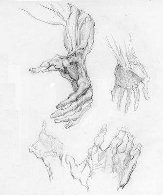
Here are some pencil sketches, ostensibly meant for "The Anatomy Book Project." The biggest hand is the good one; I'm very marginal at hands, and can only produce worthy results after a great deal of application. I'm curious what you guys think of the style on the big one, which is a somewhat tonal approach crossed with a little linear flourish. I think the best part is the forearm/upper arm region, where I'm indicating the muscles very graphically (maybe I should say "linear-ly", if that's any sort of word). I am attracted to this because I like the shapes of the fingers in this flayed, corpse figure.
I did this study from a photo I took at the now-famous "Body Worlds" exhibit (still at the Science Museum in LA, by the Colisseum?). I'll post the photo reference, too.

I have a much more finished version of an arm up at the notorious EUROCHINO site, which you, dear fellow TAG-iste, are welcome to inspect.
Word.
6 comments:
My favorite part of that large hand is the thumb area where the ligature and musculature criss-crosses around the bones and joints. It’s like an aerial view of an overpass where everything moves past the wrist. There are so many hollows, especially the one at the base of the thumb and they define the mass of that area really well for me… Man, I’m going to have to start saving my change to be ready for this book when it comes out …
I'm somewhat distrustful of thin, bony fingers in drawings. Hogarth favored them and although anatomically correct, I have yet to see them in reality.
I assume in this case it's meant to show the inner structure, in which case you can completely ignore my comment... so why did I post? ;)
Great studies. I saw that Body Worlds exhibit. There was a comment book at the end of the exhibit. One wit wrote "Too many Wangs."
So are you heading back to the states? Your other Blog mentions being stressed , packing, getting ready for a flight. Watch out for rioters.
The hands are wonderful, and yes the tonal passing off to the linear works very well for me. It helps me to remember the bones under the muscles, that you show here and on your blog. Speaking of which I LOVE the one there with the horizontal arm to scapula rendering.
Anyway the fingers as bones works very well for me, and not just to remind myself of what lies beneath, but also because it gives it a... personality. One that's only _slightly_ macabre.
As you work with tone and line I'd suggest that when you're working in blue pencil as you display on your site (a favorite medium we discussed at Sony Interactive back in your dark days of quixotic animation) try binging in a few graphite lines on top, just to hit the crossovers or lend weight. B's to 3B's are my fave for this.
But why Dok why?
Right off the bat you've doubled you color!
And blue and black / dark grey work really well together as we've seen from Barry Winsor Smith's work.
PLUS the scanner likes it. There's something that happens when scanning software sees that darker value alongside light to middle blue tones - an algorithm kicks in that to my eye benefits the level range overall.
But maybe that's just the 60's still making their contributions to my brainpan.
Thanks guys!
In reverse order:
DOK:Yr tip re: improved scanning quality is much appreciated; as to adding regular graphite to the blue pencil, I haven't done enough of this. In fact, these are some of the first blue pencils I've done in a long time--and the first I've scanned. Glad you liked the arm on the EUROCHINO site!
EL: Everything is actually very peaceful here--but then, we aren't marching in the protests! One thought: since we've moved here, Paris has had 25 days of riots, a nasty winter, and now nearly a month of protests and intermittent strikes; in two weeks we are relocating to Burbank. Sad news for the residents of Burbank, I suppose; with our arrival, the odds of an uneventful summer in the Greater Los Angeles Area are about to take a nosedive.
RICK: I like yr thoughts about skinny fingers and they are really relevant. This drawing represents a specific strain of "cadaver thinking" that will show up in the book, but not be the dominant style: I hope to intersperse some fancy cadaver drawings (like this one) to work as both stylistic counterpoint, and thought-provoker. There will be lots of fat finger drawings in the future, esp. as these are the only sort of fingers I got!
TOM C.: Start saving now.
TO ALL: No one commented on the relation between the drawing and the source material. I am trying to make the drawing offer up better, more useful information than the photo. I will assume it succeeds in this way, since no one complained about liking that ghastly photo better....
You are correct - the drawing tells much more than the photo.
Post a Comment